Brand kit
The toSend brand. Used right.
Logos, color, type, and imagery for press, partners, and integrations. Free to use within these guidelines. Last updated April 2026.
One mark, one wordmark, two colorways.
The mark is a paper-plane glyph in our deep plum, with a sheen overlay for depth. The lockup pairs the mark with the toSend wordmark — the "S" picks up the brand accent.


Clear space & minimum size.
Keep at least one mark-height of clear space on every side. The mark should never appear smaller than 24×24 pixels on screen, or 8mm in print.
- Padding: at least 1× mark height on every side. More if you can spare it.
- Minimum size: 24px on screen, 8mm in print. Below that, the sheen flattens out.
- Lockup minimum: 96px wide for the lockup. Below that, switch to the mark only.
- Co-branding: equal visual weight to other logos. Vertical divider with 1.5× clear space on each side.
Color.
A warm-stone palette anchored by deep plum. Click any swatch to copy the hex value.
Type.
System fonts only. No web font loads, no FOIT, no layout shift — just whatever looks best on the reader's OS. We use a single italic serif accent for emphasis.
Display · system-ui weight 600
$3 per 10,000 emails.
Italic accent · ui-serif italic 500
Every feature included.
Body · system-ui regular
toSend is built for small teams who don't want to fight billing pages, queue limits, or "Pro" tiers. Sign up takes under a minute.
Mono · ui-monospace
POST https://api.tosend.com/v2/emails
Sans / display / body
-apple-system, BlinkMacSystemFont, "Segoe UI", Roboto, "Helvetica Neue", Arial, sans-serif Serif (italic accent only)
ui-serif, Georgia, "Times New Roman", serif Mono
ui-monospace, SFMono-Regular, "SF Mono", Menlo, Consolas, "Liberation Mono", monospace Do & don't.
Three rules to keep the mark recognizable. Everything else is taste — use yours.
DO
Use the mark as supplied. The plum, the sheen, the rounded square — all part of one mark.
DO
Switch to the white lockup on dark or photographic backgrounds. The "S" stays in lighter plum for accent.
DON'T
Recolor the mark, the wordmark, or the "S" highlight. The plum is the brand.
DON'T
Stretch, skew, rotate, or apply effects (drop shadows, glows, outlines) to the mark.
toSend
DON'T
Set the wordmark in another typeface. Use the supplied lockup files instead.
DON'T
Place on busy or low-contrast backgrounds. If in doubt, use a paper-soft or ink card behind it.
Press imagery.
Default Open Graph card and a founder photo for press use. Feel free to crop and tone-correct.
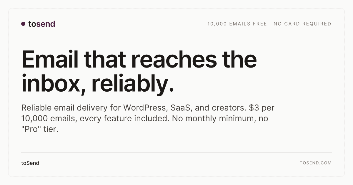

Press
For press, partnerships, or anything brand-related.
We're a small team. Send us a note — a real human will reply, usually the same day.
By using these assets you agree to keep the mark recognizable, follow the rules above, and not imply partnership without our written consent.